40 Advanced Features
40.1 Advanced Features
All the features we were able to extract were related to what day or time it was for a given observation. Or numbers on the form “how many since the start of the month” or “how many days since the start of the week”. And while this information can be useful, there will often be times when we want to do slight modifications that can result in huge payoffs.
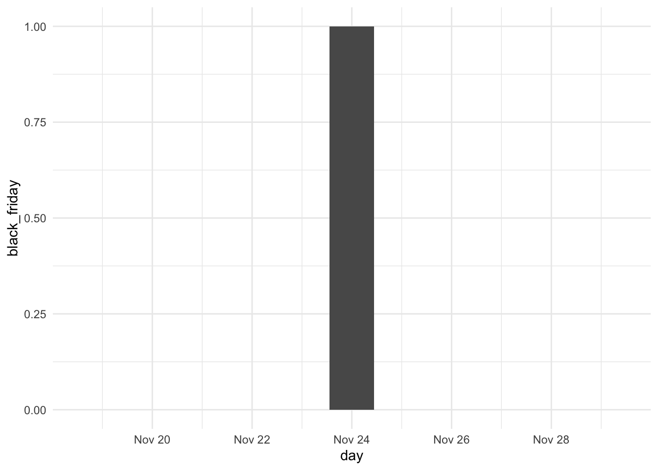
Consider merchandise sale-related data. The mere indication of specific dates might become useful, but the sale amount is not likely to be affected just on the sale days, but on the surrounding days as well. Consider the American Black Friday. This day is predetermined to come every year at an easily recognized day, namely the last Friday of November. Considering its close time to Christmas and other gift-giving holidays, it is a common day for thrifty people to start buying presents.
In the extraction since we have a single indicator for the day of Black Friday
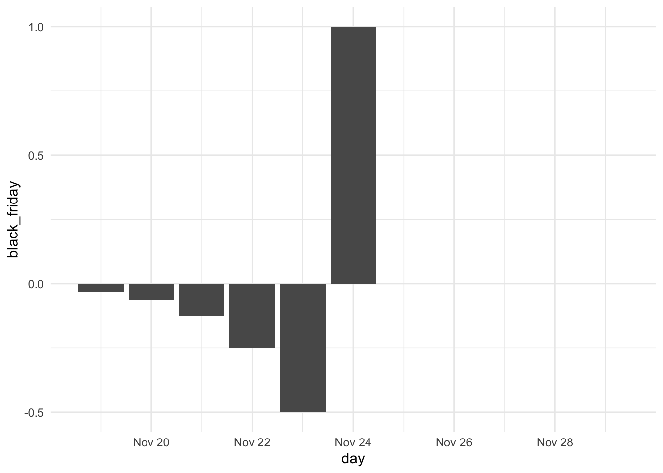
But it would make sense that since we know the day of Black Friday, that the sales will see a drop on the previous days, we can incorporate that as well.
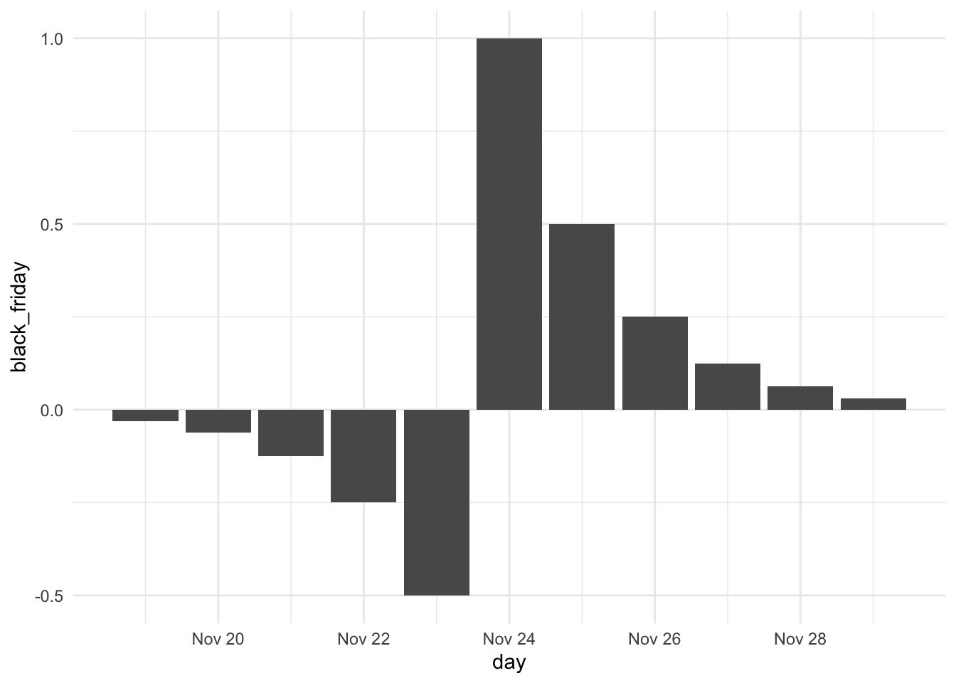
On the other hand, once the sale has started happening the sales to pick up again. Since this is the last big sale before the Holidays, shoppers are free to buy their remaining presents as they don’t have to fear the item going on sale.
The exact effects shown here are just approximate to our story at hand. But they provide a useful illustration. There is a lot of bandwidth to be given if we look at date times from a distance perspective. We can play around with “distance from” and “distance to”, different numerical transformations we saw in Numeric Overview, and signs and indicators we talked about in Chapter 39 to tailor our feature engineering to our problem.
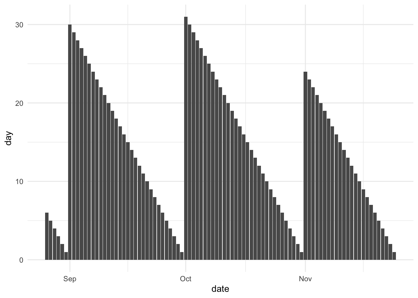
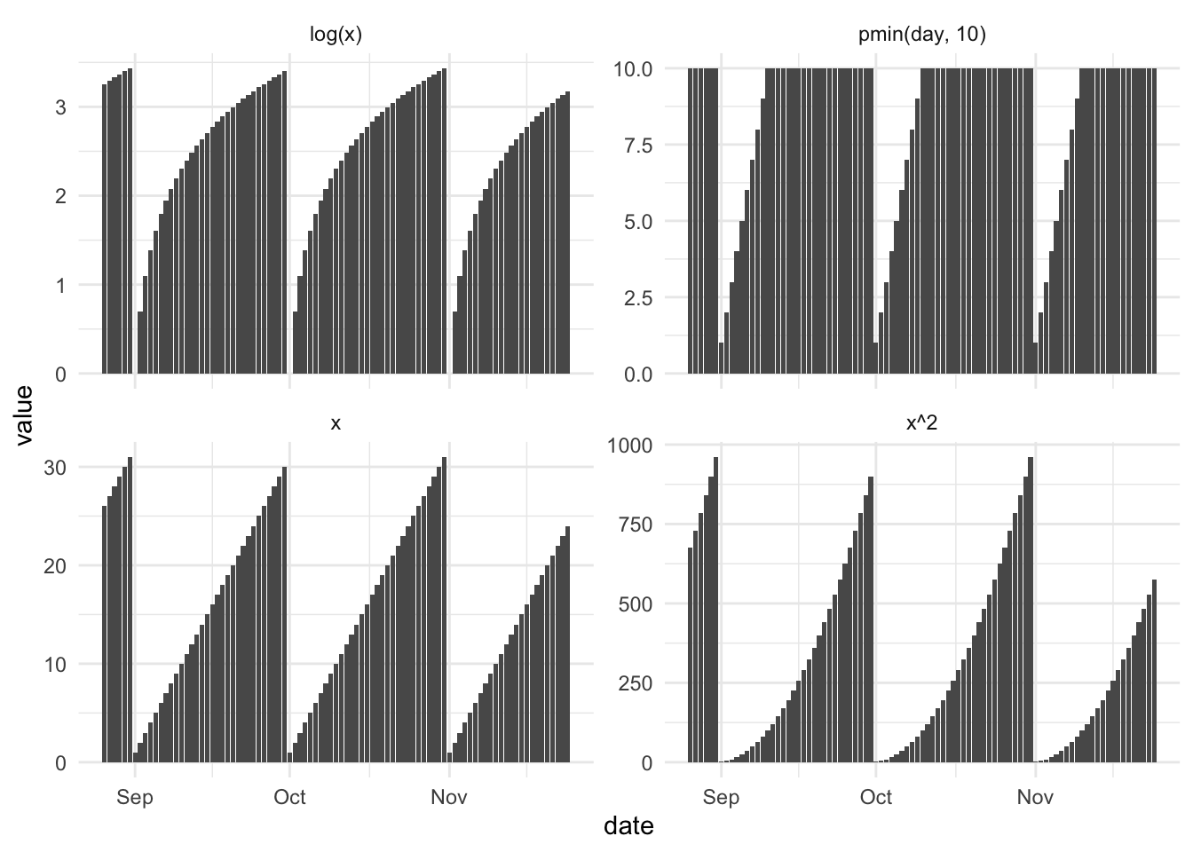
What all these methods have in common is a reference point. For an extracted day feature, the reference point is “first of the month” and the after-function is x, or in other words “days since the time of day”. We see this in the following chart. Almost all extracted functions follow this formula

we could just as well do the inverse and look at how many days are left in the month. This would have a before-function of x as well.
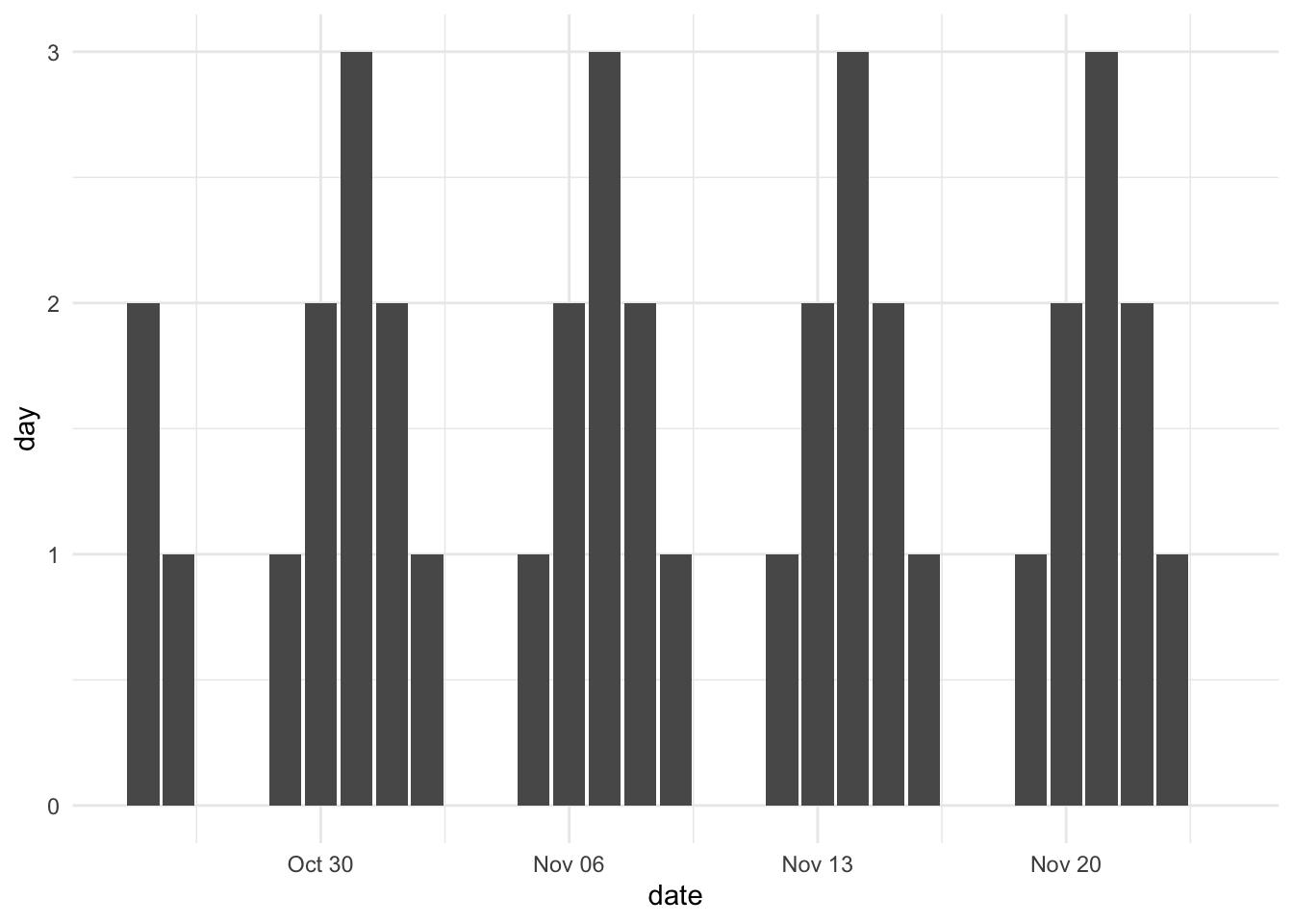
We can do a both-sided formula by looking at “how many days are we away from a weekend”. This would have both the before and after functions be x and look like so. Here it isn’t too interesting as it is quite periodic, but using the same measure with “sale” instead of “weekend” and suddenly you have something different.
There are many other functions you can use, they will depend entirely on your task at hand. A few examples are shown below for inspiration.
What makes these calculations so neat is that they can be tailored to our task at hand and that they work with irregular events such as holidays and signup dates. These methods are not circular by definition, but they will work in many ways it. We will cover explicit circular methods in Chapter 41.