13 Polynomial Expansion
13.1 Polynomial Expansion
Polynomial expansion, is one way to turn a numeric variable into something that can represent a non-linear relationship between two variables. This is useful in modeling content since it allows us to model non-linear relationships between predictors and outcomes. This is a trained method.
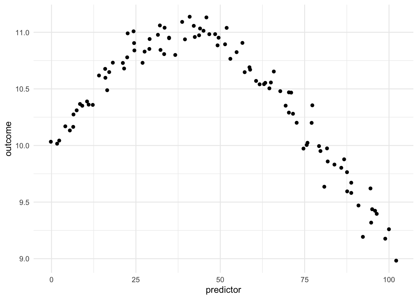
Being able to transform a numeric variable that has a non-linear relationship with the outcome into one or more variables that do have linear relationships with the outcome is of great importance, as many models wouldn’t be able to work with these types of variables effectively themselves. Below is a toy example of one such variable
Here we have a non-linear relationship. It is a fairly simple one, the outcome is high when the predictor takes values between 25 and 50, and outside the ranges, it takes over values. Given that this is a toy example, we do not have any expert knowledge regarding what we expect the relationship to be outside this range. The trend could go back up, it could go down or flatten out. We don’t know.
As we saw in the Binning, one way to deal with this non-linearity is to chop up the predictor and emit indicators for which region the values take. While this works, we are losing quite a lot of detail by the rounding that occurs.
We know that we can fit a polynomial function to some data set. And it would take the following format
\[ \text{poly}(x,\ \text{degree} = n) = a_0 + a_1 x + a_2 x ^ 2 + \cdots + a_n x ^ n \]
This can then be used to generate features. Each feature is done by taking the value to a given degree and multiplying it according to the corresponding coefficient.
tibble::tibble(
  x = 1:5,
  `x^2` = (1:5) ^ 2,
  `x^3` = (1:5) ^ 3,
  `x^4` = (1:5) ^ 4
) |>
knitr::kable()| x | x^2 | x^3 | x^4 |
|---|---|---|---|
| 1 | 1 | 1 | 1 |
| 2 | 4 | 8 | 16 |
| 3 | 9 | 27 | 81 |
| 4 | 16 | 64 | 256 |
| 5 | 25 | 125 | 625 |
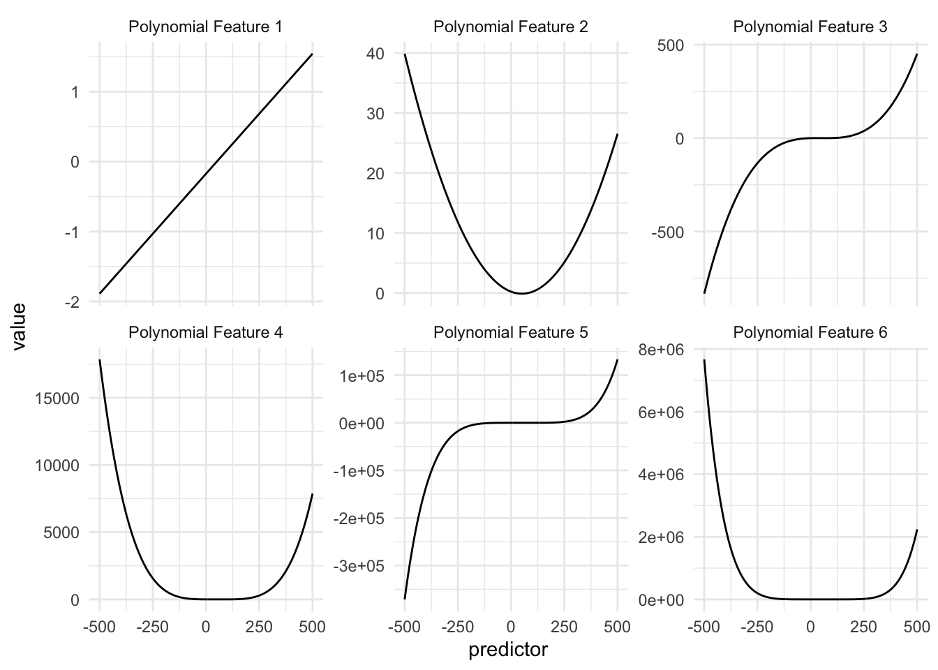
In the above table, we see a small example of how this could be done, using a 4th-degree polynomial with coefficients of 1. If we were to look at the individual functions over the domain of our data we see the following
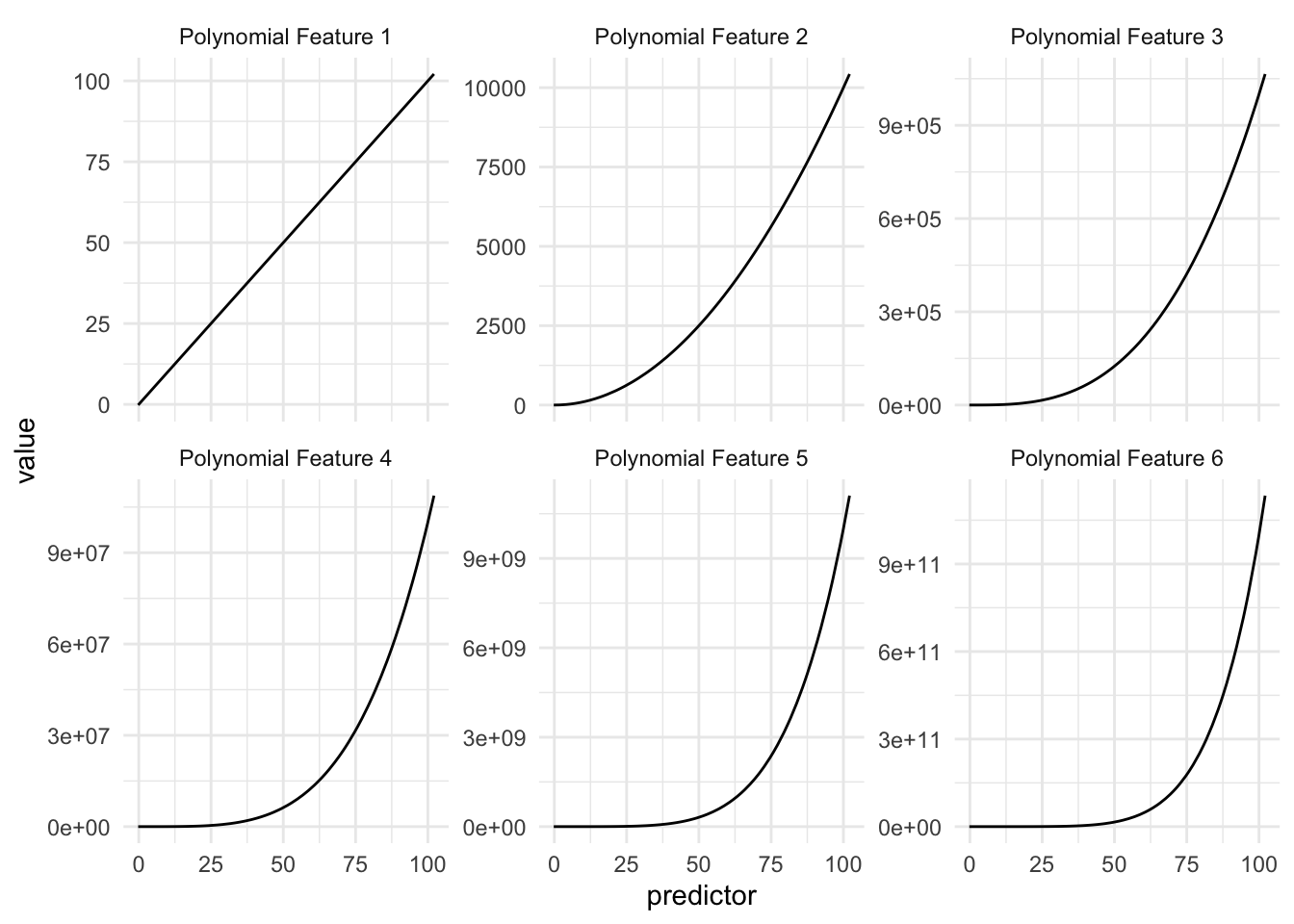
This is to be expected, but we are noticing that these curves look quite similar, and the values these functions are taking very quickly escalate. And this is for predictor values between 0 and 100, higher values will get even higher, possibly causing overflow issues.
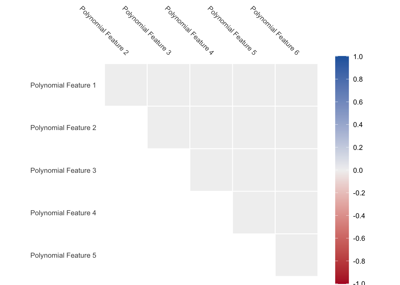
We also have an issue where the values appear quite correlated since the functions are all increasing. As we see below, the correlation between the variables is close to 1 for all pairs.
Warning: Using `size` aesthetic for lines was deprecated in ggplot2 3.4.0.
ℹ Please use `linewidth` instead.
ℹ The deprecated feature was likely used in the corrr package.
  Please report the issue at <https://github.com/tidymodels/corrr/issues>.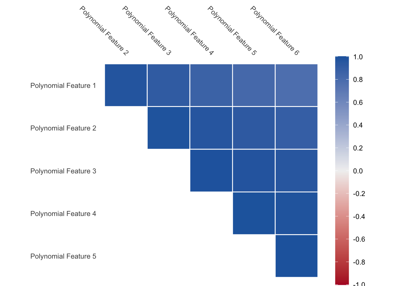
This is a problem that needs to be dealt with. The way we can deal with this is by calculating orthogonal polynomials instead. We have that any set polynomial function can be rewritten as a set of orthogonal polynomial functions.
CautionTODO
Add more bath background here
With this, we deal with the two problems we had before. As seen in the figure below, the functions take smaller values within their ranges
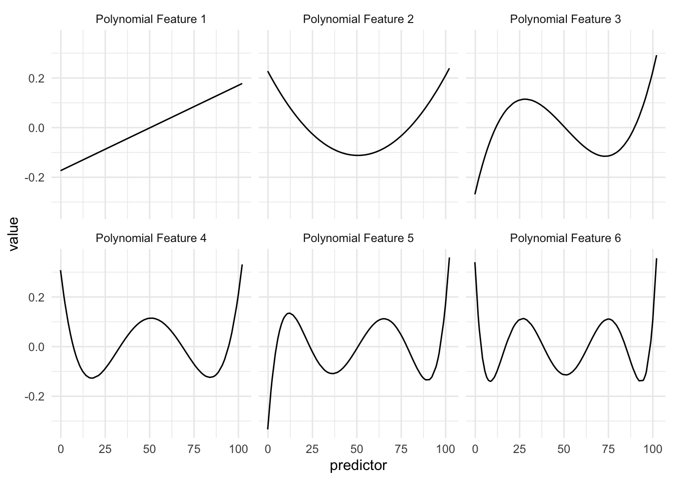
And since they are orthogonal by design, we won’t have to worry about correlated features.
The interpretation of these polynomial features is not as easy as with Binning or Splines, but the calculations are quite fast and versatile.
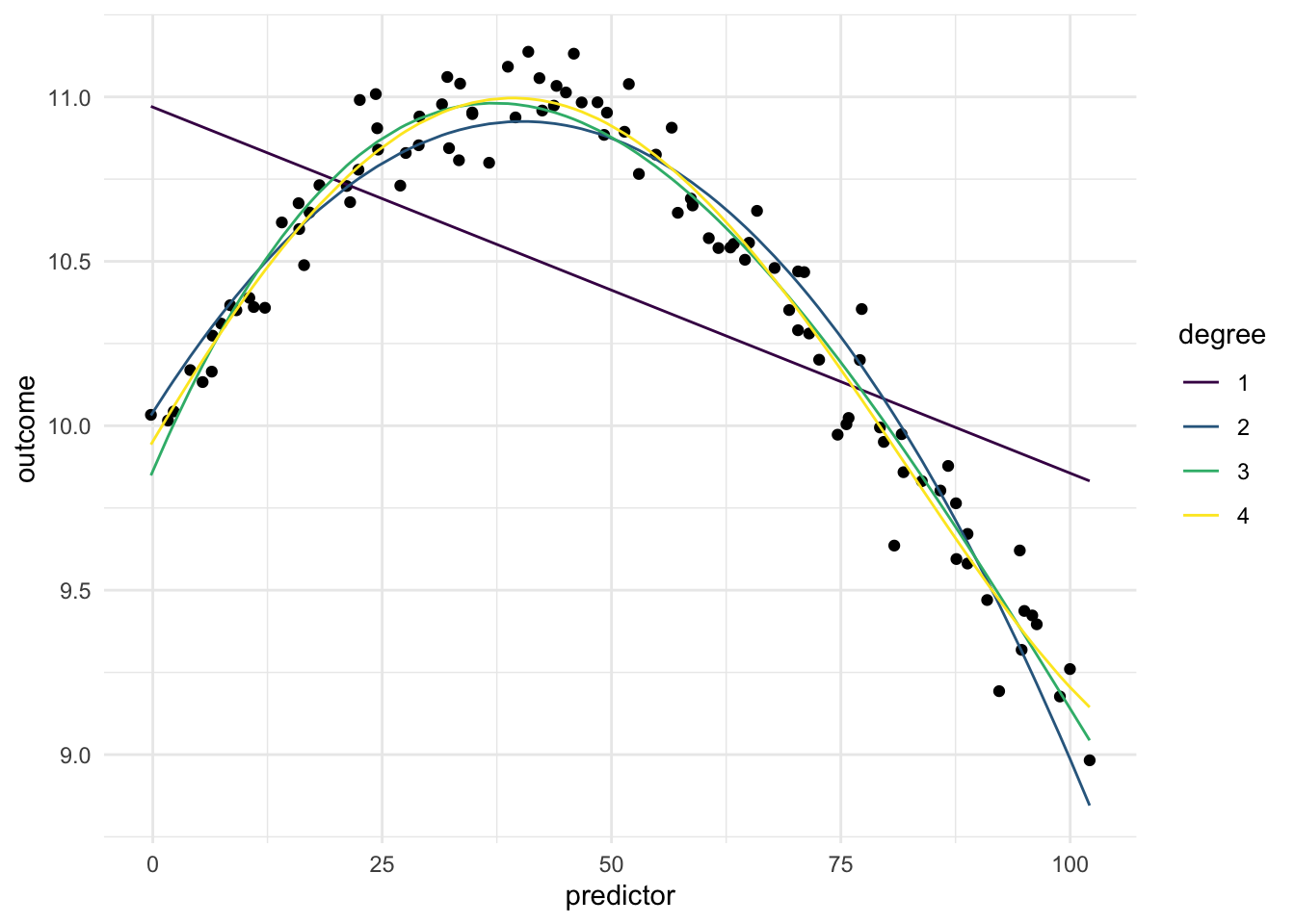
Below is a chart of how well using polynomial expansion works when using it on our toy example. Since the data isn’t that complicated, having a degree larger than 1 will do the trick.
13.2 Pros and Cons
13.2.1 Pros
- Works fast computationally
- Good performance compared to binning
- Doesn’t create correlated features
- Is good at handling continuous changes in predictors
13.2.2 Cons
- Arguably less interpretable than binning and splines
- Can produce a lot of variables
- Have a hard time modeling sudden changes in distributions
13.3 R Examples
We will be using the ames data set for these examples.
library(recipes)
library(modeldata)

ames |>
  select(Lot_Area, Year_Built)
# A tibble: 2,930 × 2
Lot_Area Year_Built
<int> <int>
1 31770 1960
2 11622 1961
3 14267 1958
4 11160 1968
5 13830 1997
6 9978 1998
7 4920 2001
8 5005 1992
9 5389 1995
10 7500 1999
# ℹ 2,920 more rows{recipes} has the function step_poly() for just this occasion.
poly_rec <- recipe(~ Lot_Area + Year_Built, data = ames) |>
  step_poly(Lot_Area, Year_Built)

poly_rec |>
  prep() |>
  bake(new_data = NULL) |>
  glimpse()
Rows: 2,930
Columns: 4
$ Lot_Area_poly_1 <dbl> 5.070030e-02, 3.456477e-03, 9.658577e-03, 2.373161e-…
$ Lot_Area_poly_2 <dbl> -0.052288355, -0.006139895, -0.013560043, -0.0048015…
$ Year_Built_poly_1 <dbl> -0.0069377547, -0.0063268386, -0.0081595868, -0.0020…
$ Year_Built_poly_2 <dbl> -0.0188536923, -0.0189190631, -0.0186090288, -0.0183…If you don’t like the default number of features created, you can use the degree argument to change it.
poly_rec <- recipe(~ Lot_Area + Year_Built, data = ames) |>
  step_poly(Lot_Area, Year_Built, degree = 5)

poly_rec |>
  prep() |>
  bake(new_data = NULL) |>
  glimpse()
Rows: 2,930
Columns: 10
$ Lot_Area_poly_1 <dbl> 5.070030e-02, 3.456477e-03, 9.658577e-03, 2.373161e-…
$ Lot_Area_poly_2 <dbl> -0.052288355, -0.006139895, -0.013560043, -0.0048015…
$ Lot_Area_poly_3 <dbl> 0.0024951091, 0.0067956902, 0.0110336270, 0.00588901…
$ Lot_Area_poly_4 <dbl> 0.0390305341, -0.0078110499, -0.0092519823, -0.00723…
$ Lot_Area_poly_5 <dbl> -0.0649379780, 0.0051370320, 0.0004088393, 0.0055404…
$ Year_Built_poly_1 <dbl> -0.0069377547, -0.0063268386, -0.0081595868, -0.0020…
$ Year_Built_poly_2 <dbl> -0.0188536923, -0.0189190631, -0.0186090288, -0.0183…
$ Year_Built_poly_3 <dbl> -0.0031709327, -0.0044248985, -0.0006208212, -0.0124…
$ Year_Built_poly_4 <dbl> 1.420211e-02, 1.311711e-02, 1.609112e-02, 3.358699e-…
$ Year_Built_poly_5 <dbl> 0.009938840, 0.011096007, 0.007277173, 0.015173692, …while you properly shouldn’t, you can turn off the orthogonal polynomials by setting options = list(raw = TRUE).
poly_rec <- recipe(~ Lot_Area + Year_Built, data = ames) |>
  step_poly(Lot_Area, Year_Built, options = list(raw = TRUE))

poly_rec |>
  prep() |>
  bake(new_data = NULL) |>
  glimpse()
Rows: 2,930
Columns: 4
$ Lot_Area_poly_1 <dbl> 31770, 11622, 14267, 11160, 13830, 9978, 4920, 5005,…
$ Lot_Area_poly_2 <dbl> 1009332900, 135070884, 203547289, 124545600, 1912689…
$ Year_Built_poly_1 <dbl> 1960, 1961, 1958, 1968, 1997, 1998, 2001, 1992, 1995…
$ Year_Built_poly_2 <dbl> 3841600, 3845521, 3833764, 3873024, 3988009, 3992004…13.4 Python Examples
We are using the ames data set for examples. {sklearn} provided the PolynomialFeatures(). We can use it out of the box.
from feazdata import ames
from sklearn.compose import ColumnTransformer
from sklearn.preprocessing import PolynomialFeatures

ct = ColumnTransformer(
    [('polynomial', PolynomialFeatures(), ['Lot_Area'])],
    remainder="passthrough")

ct.fit(ames)
ColumnTransformer(remainder='passthrough',
transformers=[('polynomial', PolynomialFeatures(),
['Lot_Area'])])In a Jupyter environment, please rerun this cell to show the HTML representation or trust the notebook. On GitHub, the HTML representation is unable to render, please try loading this page with nbviewer.org.
ColumnTransformer(remainder='passthrough',
                  transformers=[('polynomial', PolynomialFeatures(),
['Lot_Area'])])['Lot_Area']
PolynomialFeatures()
['MS_SubClass', 'MS_Zoning', 'Lot_Frontage', 'Street', 'Alley', 'Lot_Shape', 'Land_Contour', 'Utilities', 'Lot_Config', 'Land_Slope', 'Neighborhood', 'Condition_1', 'Condition_2', 'Bldg_Type', 'House_Style', 'Overall_Cond', 'Year_Built', 'Year_Remod_Add', 'Roof_Style', 'Roof_Matl', 'Exterior_1st', 'Exterior_2nd', 'Mas_Vnr_Type', 'Mas_Vnr_Area', 'Exter_Cond', 'Foundation', 'Bsmt_Cond', 'Bsmt_Exposure', 'BsmtFin_Type_1', 'BsmtFin_SF_1', 'BsmtFin_Type_2', 'BsmtFin_SF_2', 'Bsmt_Unf_SF', 'Total_Bsmt_SF', 'Heating', 'Heating_QC', 'Central_Air', 'Electrical', 'First_Flr_SF', 'Second_Flr_SF', 'Gr_Liv_Area', 'Bsmt_Full_Bath', 'Bsmt_Half_Bath', 'Full_Bath', 'Half_Bath', 'Bedroom_AbvGr', 'Kitchen_AbvGr', 'TotRms_AbvGrd', 'Functional', 'Fireplaces', 'Garage_Type', 'Garage_Finish', 'Garage_Cars', 'Garage_Area', 'Garage_Cond', 'Paved_Drive', 'Wood_Deck_SF', 'Open_Porch_SF', 'Enclosed_Porch', 'Three_season_porch', 'Screen_Porch', 'Pool_Area', 'Pool_QC', 'Fence', 'Misc_Feature', 'Misc_Val', 'Mo_Sold', 'Year_Sold', 'Sale_Type', 'Sale_Condition', 'Sale_Price', 'Longitude', 'Latitude']
passthrough
ct.transform(ames) polynomial__1 ... remainder__Latitude
0 1.0 ... 42.054
1 1.0 ... 42.053
2 1.0 ... 42.053
3 1.0 ... 42.051
4 1.0 ... 42.061
... ... ... ...
2925 1.0 ... 41.989
2926 1.0 ... 41.988
2927 1.0 ... 41.987
2928 1.0 ... 41.991
2929 1.0 ... 41.989
[2930 rows x 76 columns]Or we can change the degree using the degree argument
ct = ColumnTransformer(
    [('polynomial', PolynomialFeatures(degree = 4), ['Lot_Area'])],
    remainder="passthrough")

ct.fit(ames)
ColumnTransformer(remainder='passthrough',
transformers=[('polynomial', PolynomialFeatures(degree=4),
['Lot_Area'])])In a Jupyter environment, please rerun this cell to show the HTML representation or trust the notebook. On GitHub, the HTML representation is unable to render, please try loading this page with nbviewer.org.
ColumnTransformer(remainder='passthrough',
                  transformers=[('polynomial', PolynomialFeatures(degree=4),
['Lot_Area'])])['Lot_Area']
PolynomialFeatures(degree=4)
['MS_SubClass', 'MS_Zoning', 'Lot_Frontage', 'Street', 'Alley', 'Lot_Shape', 'Land_Contour', 'Utilities', 'Lot_Config', 'Land_Slope', 'Neighborhood', 'Condition_1', 'Condition_2', 'Bldg_Type', 'House_Style', 'Overall_Cond', 'Year_Built', 'Year_Remod_Add', 'Roof_Style', 'Roof_Matl', 'Exterior_1st', 'Exterior_2nd', 'Mas_Vnr_Type', 'Mas_Vnr_Area', 'Exter_Cond', 'Foundation', 'Bsmt_Cond', 'Bsmt_Exposure', 'BsmtFin_Type_1', 'BsmtFin_SF_1', 'BsmtFin_Type_2', 'BsmtFin_SF_2', 'Bsmt_Unf_SF', 'Total_Bsmt_SF', 'Heating', 'Heating_QC', 'Central_Air', 'Electrical', 'First_Flr_SF', 'Second_Flr_SF', 'Gr_Liv_Area', 'Bsmt_Full_Bath', 'Bsmt_Half_Bath', 'Full_Bath', 'Half_Bath', 'Bedroom_AbvGr', 'Kitchen_AbvGr', 'TotRms_AbvGrd', 'Functional', 'Fireplaces', 'Garage_Type', 'Garage_Finish', 'Garage_Cars', 'Garage_Area', 'Garage_Cond', 'Paved_Drive', 'Wood_Deck_SF', 'Open_Porch_SF', 'Enclosed_Porch', 'Three_season_porch', 'Screen_Porch', 'Pool_Area', 'Pool_QC', 'Fence', 'Misc_Feature', 'Misc_Val', 'Mo_Sold', 'Year_Sold', 'Sale_Type', 'Sale_Condition', 'Sale_Price', 'Longitude', 'Latitude']
passthrough
ct.transform(ames) polynomial__1 ... remainder__Latitude
0 1.0 ... 42.054
1 1.0 ... 42.053
2 1.0 ... 42.053
3 1.0 ... 42.051
4 1.0 ... 42.061
... ... ... ...
2925 1.0 ... 41.989
2926 1.0 ... 41.988
2927 1.0 ... 41.987
2928 1.0 ... 41.991
2929 1.0 ... 41.989
[2930 rows x 78 columns]